4 Tips to create memorable product sheets
To illustrate your product sheets, is it enough to take beautiful photos? Not so sure! In order to stand out from the competition and make an impression on your visitors, new means of illustration must now be used. We will see through concrete examples how e-retailers combine creativity and new technologies to differentiate their product sheets.
| Diversify your photos
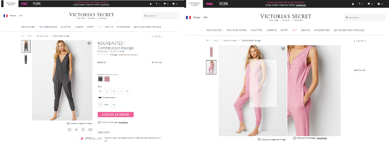
Victoria’s Secret uses a good practice for its visuals. Its product sheets offer as many visuals as available patterns or colors. Its customers can thus get an idea of the nuance or version that they like the most. The Asos website goes even further by offering three types of visuals depending on the size of the model (small, medium, and large). The retailer also systematically cites the measurements of the model illustrating the product. This approach involves not only a multiplication of the number of photos but also optimized management of the groupings of SKUs so that logistics and shipping services keep up with the pace.

| Show a Diagram
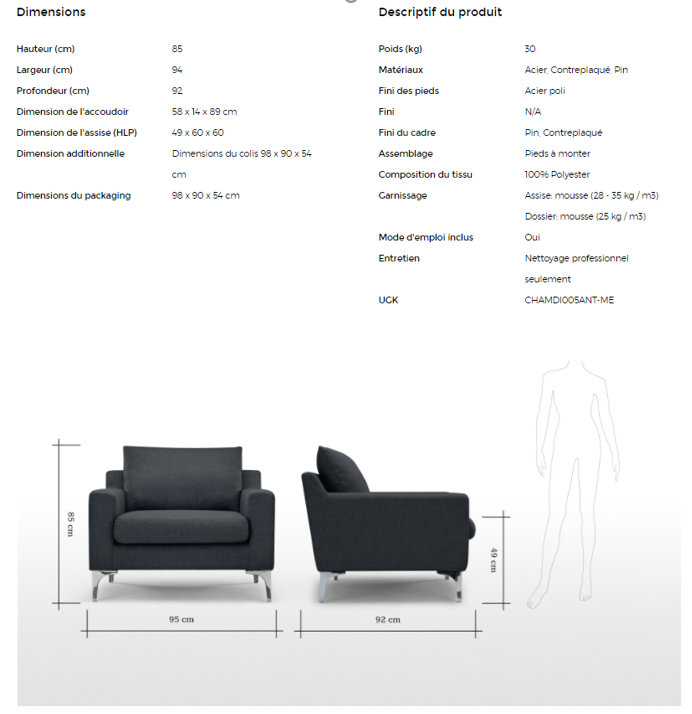
It is also a good practice to accompany your product sheet with an explanatory diagram. This is particularly true for household appliances or furniture. French people buy a sofa on average every 15 years, so it is not surprising that they have difficulty visualizing the size of their future purchase as they could do in a store. The pure player Made.com has understood this well and thus accompanies all of its sheets with a diagrammatic explanation of the dimensions of the products and what it represents compared to a person.

| Insert a Video
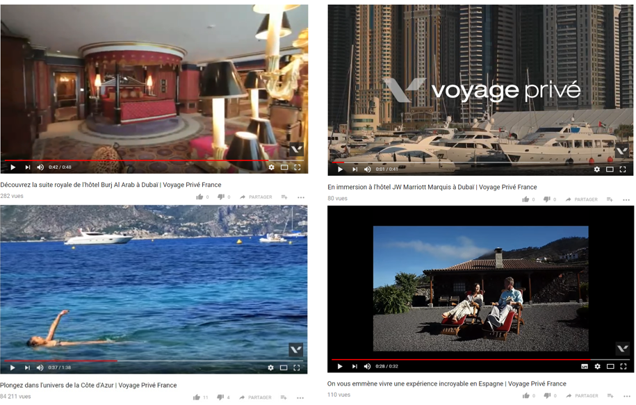
Despite a larger budgetary weight than photos, video is increasingly popular for showcasing products. This type of illustration should help your customers or potential customers better visualize their purchase. If some retailers like Asos already use this technique to present collections worn by models and parading, it is travel that has seized this new trend. Voyage-privé thus illustrates almost all of its sheets with a presentation video. While it is difficult both budgetarily and logistically to have content for all hotels or even rooms offered, Voyage Privé has found a way around it by offering: videos of the most exclusive rooms offered on the site (e.g., Royal Suite Hotel Burj-Al Arab in Dubai), videos of their top hotels they want to highlight (e.g., Hotel JW Marriott Marquis in Dubai), and generic videos of destinations for hotels for which they do not have elements (e.g., Dive into the world of the French Riviera). The travel sales event agency also offers discovery videos of certain regions of the world to generate traffic on its site and trigger potential desires. If the video is extremely attractive to your customers, be careful not to alter the performance of your pages and therefore the browsing experience of your visitors. We advise you to place the videos below the fold of your pages’ loading to ensure that your customers quickly have access to the content and actions they really need.

| Make a 360° Presentation
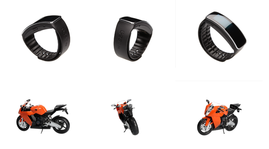
The trend is also to prefer a 360° view for the star products in your catalog. For this, you can call on specialists in the field to industrialize the creation of your photos. The company Orbitvu has thus designed photo booths for simple 360° shooting. These booths allow shooting from all angles of the coffee mug to large cars (see example below).

Your visuals are crucial, and a multitude of solutions are available to you to improve them. If you still have doubts about the necessary investment, don’t forget that it will help you improve your Average Cart: 67% of consumers believe that visuals play an essential role in choosing a product, and even 50% of them think it is more important than the description. Optimized visuals are therefore…
N'hésitez pas à partager cet article !
"4 Tips to create memorable product sheets"

